
Can a single, simple tool make your porch and patio feel like a gallery of living art?
This guide shows exactly how a color wheel can help you pick plant pairings that boost curb appeal at your home. You’ll learn core schemes designers lean on—complementary, analogous, monochromatic, triad, and double complementary—and see real garden pairings that work in containers.
We translate color theory into practical steps you can try today. Learn to tell warm from cool hues, pick a palette that suits sun and watering needs, and assemble pots with balance and texture.
Expect clear ideas and a simple process that fits one pot or many gardens. With a few confident choices, foliage and bloom pairings will support each other as seasons shift, keeping your plan lively and low-maintenance.
Key Takeaways
- Use basic schemes—opposites, neighbors, single-hue mixes—to build reliable palettes.
- Match plants by light and water first, then pair for contrast or harmony.
- Combine blooms with varied foliage and texture for season-long appeal.
- Keep designs simple, repeat colors for cohesion across your garden.
- Start with one pot, then scale the same palette to other areas at home.
Get started: color wheel basics for potted plants and flowers
A quick look at the spectrum gives you an easy map for pairing blooms and foliage. Primary colors anchor the wheel and guide mood—warm hues energize, cool tones calm. Knowing a few simple schemes turns choices into confident garden color decisions.
Primary colors, warm vs. cool: what sets the mood in your pots
Primary colors—red, yellow, blue—form the basis of every tint and shade on a full wheel. The chart follows a rainbow: red and orange next to yellow, then green, blue, purple, and violet.
Warm tones from red through chartreuse bring energy to a small pot or large landscape. Cool tones from green through violet soothe and feel more restful. Think of these families as mood tools when you plan combinations.
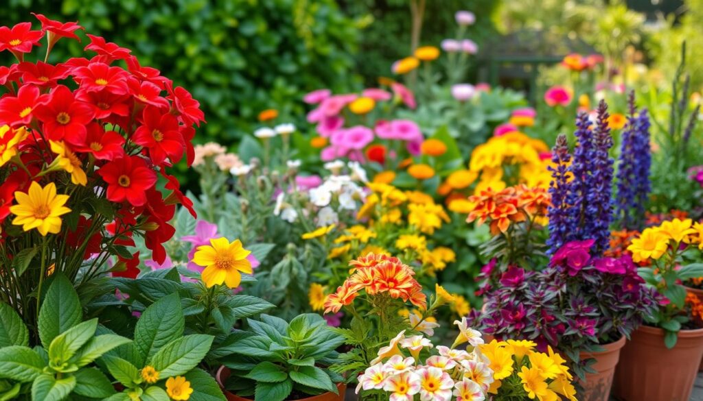
Analogous, complementary, triad, monochromatic: the core color schemes
Proven schemes help you match flowers and foliage with purpose. Complementary pairs (opposites) make blooms pop, while analogous neighbors give a calm flow. A monochromatic, or single color, approach relies on tone and texture so pots stay lively without extra hues.
- Triad: three equidistant hues for bold, balanced contrast.
- Double complementary: two adjacent hues plus their opposites for layered interest in large planters.
For a quick primer on design and garden color theory, consult basic design principles in basic design principles. Spot where your chosen shades sit on the wheel and you’ll know if combinations will sing together at peak bloom.
how use color wheel create breathtaking potted
Pick a clear scheme first: complementary for contrast or analogous for calm. Then keep your choices tight—two to three hues plus green—and plan for bloom timing so the pot peaks at the same time.
A quick sketch of ROYGBIV or a free app on your phone speeds decisions at the nursery. Try a fast check of neighbors and opposites. This simple step helps you spot workable garden color matches before you buy.

Practical tips make shopping simpler. Pick a hero bloom first and note its tone. Use that as the anchor for design and combinations. Decide the mood—lively or serene—and let it guide spacing and texture.
- Limit hues and repeat them for stronger appeal.
- Match sun and shade needs so blooms peak together.
- Structure each pot: one thriller, two to three fillers, and a spiller.
“A quick phone check of the wheel cuts indecision and saves time at the store.”
Pause at 10–15 feet and see if the pot still looks cohesive. Save a short post or note with your plant list so you can get started on the next container with confidence.
Design frameworks that work in containers: complementary, analogous, triad, and more
Pick a design framework and the rest of the pot choices fall into place. These simple schemes guide plant selection so pots feel balanced from every angle.
Complementary colors (opposites): blue-orange, purple-yellow, red-green made easy
Complementary pairs are opposites on the color wheel and boost contrast—think yellow pansy with blue salvia. Common pairs include red‑green, orange‑blue, and yellow‑purple.
Analogous harmony: neighbors on the wheel for a cohesive look
Analogous palettes blend neighboring hues like fuchsia to purple or pink foxglove with blue delphinium. They read calm and unified across a garden or single pot.
Monochromatic impact: single color, varied tones, and foliage texture
Single color schemes lean on tone and texture. Use light to deep shades—mallows, bee balm—and mix leaf shapes so the design keeps depth.
Triad and double complementary: bold palettes with high visual interest
Triad schemes use three equidistant hues (for example, orange zinnia, roses, and Mexican sage). Double complementary pairs two adjacent hues plus their opposites for layered contrast.
“A single plant with multi‑toned blooms can bridge two palettes and make transitions feel natural.”
- Simple rule: pick the scheme first, then match plants by light and water.
- Ratio: ~60% dominant, 30% secondary, 10% accent for most successful combinations.
- Test the idea in a small pot before scaling up.
| Scheme | Example pairing | Best effect |
|---|---|---|
| Complementary | Yellow pansy + blue salvia | High contrast, vibrant pop |
| Analogous | Fuchsia + purple + pink foxglove | Cohesive, soothing flow |
| Monochromatic | Pink mallow + bee balm + varied foliage | Elegant depth via tone and texture |
| Double complementary | Red dahlias + orange‑yellow black‑eyed Susan + green + purple | Dynamic, layered interest |

From nursery to patio: practical steps to build stunning combinations
Shop with a simple plan and a quick sketch—this keeps decisions fast and results consistent. Use a basic palette, note light conditions, and pick one hero plant before you fill your cart.
Breathe easy at the garden center: sketch ROYGBIV on a scrap of paper or pull up a free app to spot opposites and neighbors on the next color wheel.

Use ROYGBIV or a color wheel app to choose a palette on the spot
Tip: start with one favorite bloom and check its opposite or neighbor on the app. This keeps your choices focused and on budget.
Thriller-filler-spiller: structure your pot for balance and bloom
Pick a vertical thriller for height, then add two to three fillers at mid-height and a spiller to trail. This design reads finished from every angle.
Match plant needs: sun/shade, season of bloom, and long-bloomers
Group plants that share sun, water, and soil needs so combinations thrive over time. Stagger bloom times slightly, but ensure overlap for the main display window you want at home.
Let foliage and fruit carry color through the year
Add foliage with echoed tones—bronze, chartreuse, or silvery blue—to keep garden color when flowers pause. Consider fruiting edibles like peppers; they shift shades and extend interest across the season.
- Quick summary: Shop with a plan—palette, light, and pot structure.
- Start with a hero plant, then use a quick wheel check to find complements.
- Verify cultural needs match and bring a tape measure for pot scale.
High-impact examples and ideas inspired by garden color theory
Field-proven plant pairings help you see design rules in living examples. These examples show scale, texture, and timing so you can copy a successful palette for your porch or patio.
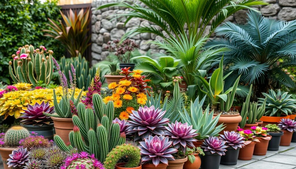
Purple and yellow pairings to spark contrast
Example: pair blue salvia with yellow pansy or a yellow Marguerite daisy with deep purple calibrachoa for high-contrast, sunny containers.
Blue and orange combos for vivid summer impact
Example: plant spring blue hyacinths beside orange tulips, then switch to orange zinnias with Mexican sage for a season-long run of bright contrast.
Pink and green: a softer red-green riff
Example: set a dahlia as the thriller, calibrachoa as filler, and sweet potato vine as spiller. The lush foliage supports continuous bloom and ties the palette together.
The soft side of the spectrum for calm displays
Example: lilies in orange, pink, and yellow form a gentle gradient. Add a neutral green backdrop to keep the arrangement serene and garden-friendly.
- Repeat one accent in two plants so colors read clearly at a distance.
- Match textures—fine foliage offsets bold daisy shapes or tubular flowers.
- Keep combinations simple: two main hues plus green for clear visual impact.
- Add a single color echo in foliage (bronze or chartreuse) to tie the palette together.
- Note bloom timing: replace fading bulbs with annuals in the same palette to maintain continuity.
Seasonal palettes and curb appeal: color schemes by time of year
Let each season guide your palette so pots offer fresh impact from early spring through fall. Plan color by season and align bloom windows so containers stay strong and visible across the year.
Coordinating bloom time keeps a pot at peak appeal. Mix early, mid, and late performers so the main palette appears together at its best. Note light and heat shifts and pick swap-ins that match your original scheme.
Spring to fall: coordinating bloom times so colors peak together
In spring, cool tones and pastels read fresh and crisp in a garden. Use blues, lavenders, and soft pinks for a calm start.
Transition to bolder hues as daylight strengthens. Stagger plants so one wave hands the scene to the next without gaps in bloom.
Fall drama: warm reds and oranges with textured foliage for energy
In fall, emphasize warm reds and oranges to add late-season punch. Textured foliage—bronze, chartreuse, and silvery leaves—keeps pots interesting after blooms fade.
If a combination feels flat midseason, add a small accent plant in a complementary hue to revive contrast and curb appeal.
- One scheme, many plants: keep your palette consistent and swap species through the season.
- Repeat key tones in pots near entries to amplify impact across the landscape.
- Shift containers to brighter spots as trees leaf out to preserve light for bloom and color.
| Season | Typical hues | Plant types | Design tip |
|---|---|---|---|
| Spring | Soft blues, lavenders, pastels | Bulbs, early annuals, cool-loving perennials | Start light; layer mid-season fillers |
| Summer | Bright pinks, bold blues, warm accents | Heat‑tolerant annuals, herbs, tropicals | Keep consistent palette; repeat accents |
| Fall | Warm reds, oranges, deep purples | Late-blooming perennials, ornamental foliage | Lean on textured foliage for lasting energy |
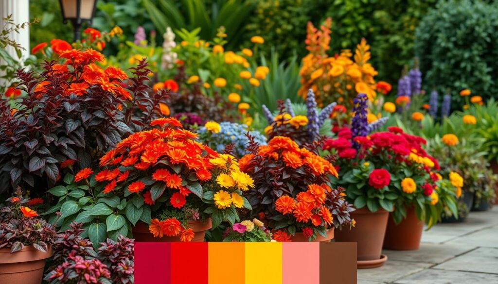
For ideas on long-term planning and staged swap-ins, see garden color schemes. A quick check with the wheel helps you pick matching swap-ins without breaking the palette.
Pro tips to refine your container color combinations
Watch closely: a plant’s foliage and fruit can hint at the perfect companion. Small echoes in leaves, stems, or peppers let you tie a palette together with subtlety and intent.
Read plant clues
Read plant “clues”: echo a hint of color from blooms in foliage
Some plants carry secondary tones that solve pairing puzzles. Bird of Paradise shows orange and blue; repeat that blue in a nearby filler to unify the pot.
At the nursery, spot orange‑toned coleus next to blue flowers like Agastache. That echo bridges contrast without harsh clash.
Tune the temperature: pair soft blues with soft oranges, not “hot” clashes
Match tonal temperature. Pair soft blues with soft oranges and keep brights with brights for a clean, lively effect.
When unsure, check the opposite color wheel position to confirm a complementary or opposite color match quickly.
Expand your plant palette: mix annuals, perennials, tropicals, and edibles
Mix types for continuous interest: annuals for nonstop bloom, perennials for backbone, tropicals for drama, and edibles like peppers for seasonal fruit color.
- Quick checklist: 60/30/10 balance, repeat one accent across containers.
- Use next color wheel neighbors to soften transitions.
- Refresh a tired spot midseason with a single plant that shares your scheme.
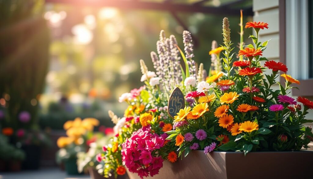
For more practical container garden design and color ideas, consult this guide to keep your gardens cohesive and confident.
Conclusion
A clear palette and a simple plan will lift any container from busy to balanced. With primary colors as your anchor and a chosen scheme, small choices add big garden appeal.
Bold summary: Pick one scheme—complementary, analogous, triad, or monochromatic—and let primary colors guide plant selection. This keeps color decisions simple and tied to basic color theory.
Remember the essentials: match light and water needs, time blooms, and repeat accents for cohesion. Two to three hues plus green make strong combinations that read well from 10–15 feet.
Lean on foliage and fruit to carry interest when flowers pause. Note successful pairings in a quick post so you can reuse the same combination next season with small tweaks for fresh impact.